Make it Max branding.
In the beginning.
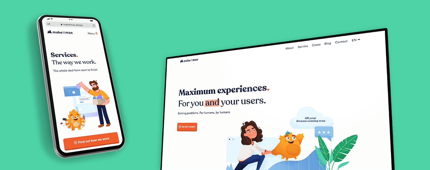
Client
Make it Max
Type
Branding, Webdesign
Deliverables
Brand, Brandbook, Website, User Experience Redesign, User Research
Website
This website, duh
-
The time has come for Make it Max to see the day of light. We started the construction of our own brand. Which brought us straight to the question of questions: how do we build a brand that people would want to work with? And secondly, how do we stand out in a saturated market?
Lucky for us, that just happens to be our thing. Meaning, Make it Max would also become a representation of our business, skills and quality. It would be an example of what we can do for you. And let’s be honest, you wouldn’t hire a design agency with a website looking like a dollar store now, would you? So saddle up because we have a brand to build!
Laying the foundation
We kicked off the project by identifying our unique features. These findings will ultimately become the building stones of our brand. Providing us with all the information we need to build a rock solid and powerful brand foundation.
Our findings
We are fun, witty and informal, yet ambitious, passionate and determined. We want to create the best experience possible – internally and externally – while offering world class, high quality solutions. We bring the absolute maximum and more. But, we also want to connect on a personal level and call you our new friend.
We value the journey just as much as reaching our (and your) goals. And with that said, we were able to establish our Core Values:
A Personal touch
We love technology. But what really makes us stand out in the crowd is our knowledge of tech in perfect harmony with a personal, human approach. We enjoy personal interactions with clients and users and we strive for long-term, flourishing relationships.
Witty in the nitty gritty
We love wittiness. Seeing you smile makes us smile even more. Humor, quirkiness and creativity, where at first there might be none, gives us energy and new ideas.
Sincerely yours
We’re honest, open and we speak our minds – politely of course. For the best long-term relationships, we expect the same from the people we work with. Only sincerity and genuineness. That’s how we Make it Max!
The building of
Make it Max
Think of a soft drink brand and the color red. Got it? Now think of a furniture company and the colors blue and yellow. Did you have Coca Cola and Ikea in mind? All famous brands have one thing in common: they all have a powerful brand book. Or bible. And sometimes style guide. But let’s stick with brand foundation.
A brand foundation consists of a set of guidelines defining your brand’s identity. A sum of all decisions that convey your thoughts and feelings, in to structures and manners.
We played around with colors, shapes, fonts, illustrations and the tone of voice. Finding that perfect balance and creating a blueprint of our brand´s DNA. There are no rules when it comes to creativity. As long as we keep in mind our personality, what we want to express and who we want to reach. This resulted in a brand foundation that we are extremely proud of! One that fully captures who we are, what we are and why we are. With a dash of wit, naturally.
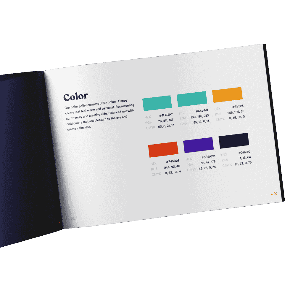
There is no beauty without color
Our color pallet consists of six colors. Happy colors that feel warm and personal. Representing our friendly and creative side. Balanced out with cold colors that are pleasant to the eye and create calmness. To let you know we are also analytic and serious about what we do. The bright colors will be used in moderation on a white, clean background. We believe that less is more. Quality before quantity, in our designs as well as in our wittiness. We are professionals first, and the life of a party second.
Perfect font pairing
Font pairing is a difficult process. You want fonts to work together without creating a conflict or fighting for attention. After having tried many combinations, we found a lovely, harmonious couple. A friendly header font that almost looks like it has its own character. Paired with a calm, easy to read font. Completely different, yet complimentary. Perfectly matching our personality.
Custom-made illustrations
We created our very own illustration style together with the very talented Danila van den Hoeven. We wanted them to really capture the essence of our brand. All our personality traits and values, in one universe. And to make people smile. Giving each and every user the full Make it Max experience.


A logo with a message
Our logo captures all of our thoughts and feelings. Through its color, shape and font. The first thing you notice about the Make it Max logo is the Local Maxima. Representing a hill and a mountain. Meaning, that sometimes you think you’ve reached your highest point. But in reality you’re on a hill and the real mountain lays in front of you. In order to climb that mountain you have to go downhill first.
Take a risk, make an investment, etc. There, at the foot of the mountain, we await you. Ready to carry you to your true maximum.
The design is playful yet simple. With small, yet smart imperfections giving it character. Finished off with our base font making it light and airy giving it room to breathe. Which you’ll be needing, because we plan on taking your breath away. 🙂
Tone of voice
We write for humans, we’re direct and sometimes we think we’re funny. We make it personal, we tell it how it is (politely of course) and avoid fancy jargon. We’ll throw in a joke now and then because laughter releases endorphins. Which make you feel happy, and we love happy people! And if it was a bad joke, we’ll sit in awkward silence for a moment.
Tone of voice
So make it personal. Make it feel like you’re talking to someone. Nobody likes talking to a robot. (Yet). Because robots barely have a likeable character. Be informal, show interest and most importantly be yourself.
We’re direct
We like talking in a direct way. This is us. This is what we think. No fancy jargon fluff to make things pretier. No sugar coating that comic sans example the client showed us. We talk in way that’s understandable and honest for everyone.
We think we funny
We like to joke around, especially in a witty way. So yeah, be creative. Use wit, one-liners, and jokes related to something other people say. Remember tho, if you’re the only one laughing, then the rest doesn’t have good taste! Or… the joke just wasn’t that funny.
Applying the brand
To apply a brand simply means to roll out your brand identity on all user touchpoints. On your website, social media and both online and offline marketing. It’s the part where your brand will finally come to life.
Website
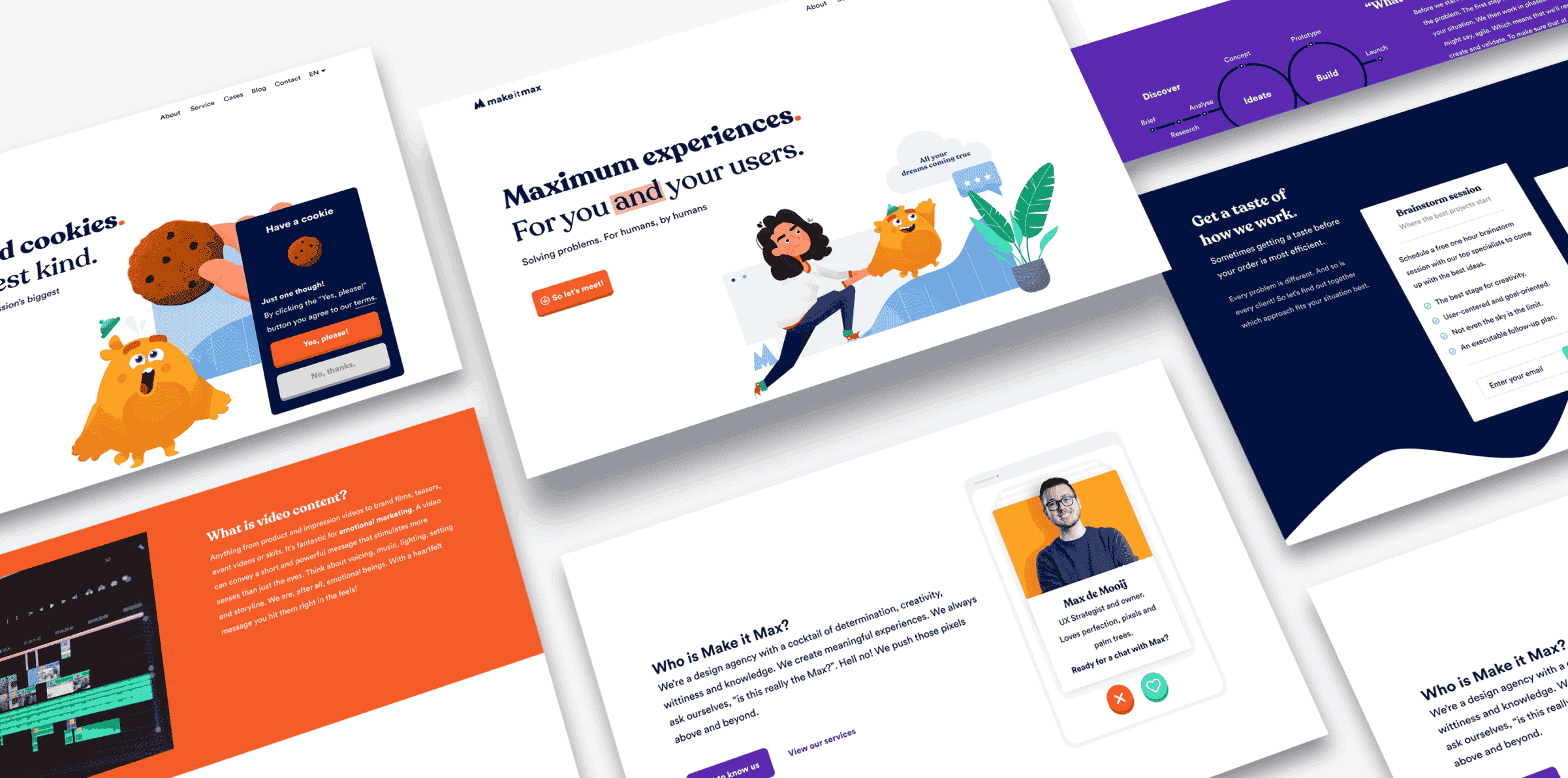
Each page is a potential first impression. So we treat them with equal importance. With care and precision we started the construction works, using our brand foundation as our blueprint and its elements as our building stones.
No matter which page you land on, you’ll know you’ve reached Make it Max. Welcome aboard, new friend!
Social media
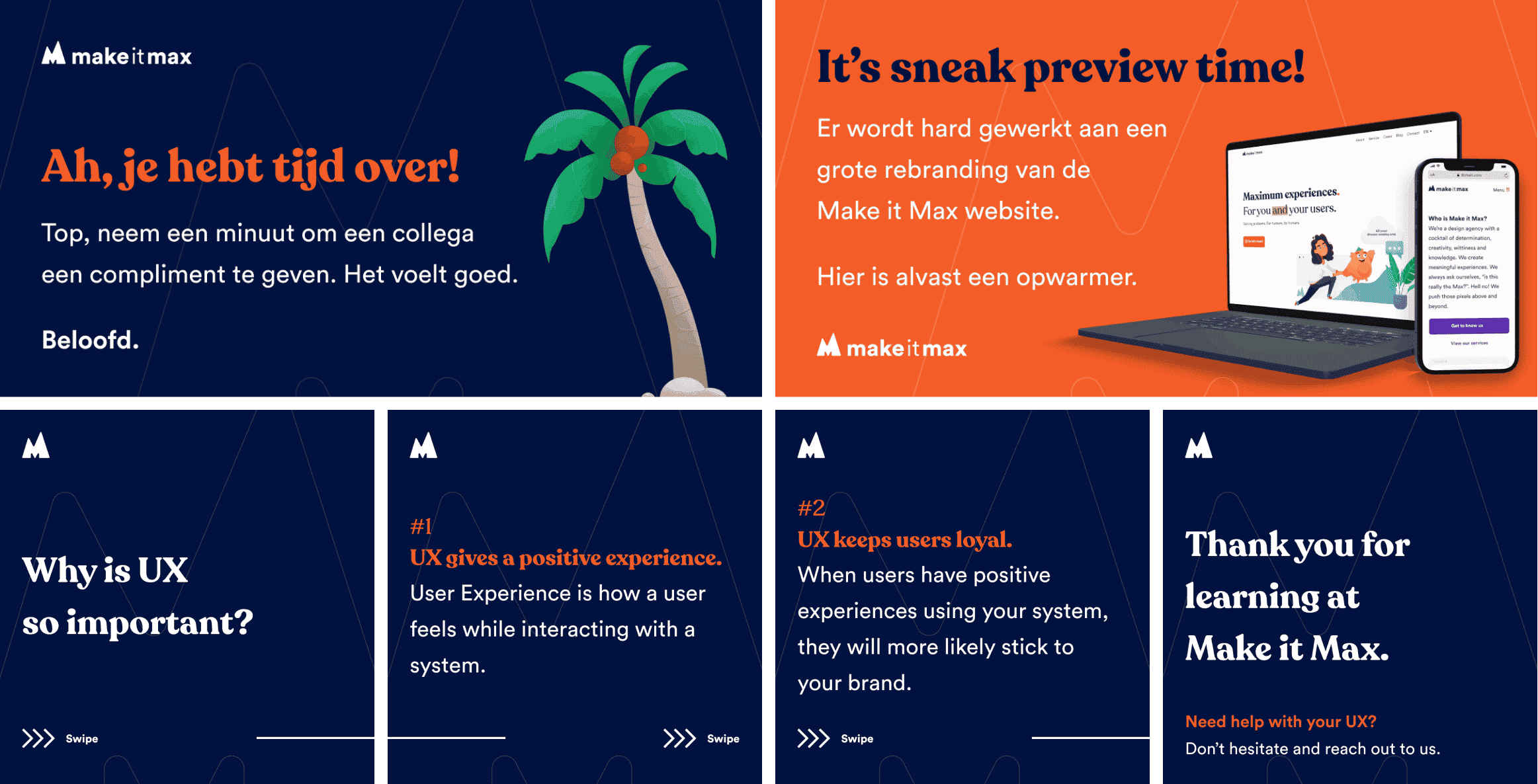
Just by scrolling past an image on Instagram, we want people to be like: ‘Hey, what is my friend Make it Max up to today?’. Each and every touchpoint, including social media, will embody our values and promise. Next time you spot us on social media, don’t be shy and drop us a hi.
Merch
Should we still invest in offline material? Heck yes! The more people see our brand, the more our name will stick in their minds. Also, it’s a big plus if you surprise your clients with a tangible gift now and then. We like to make ours feel special. And in return, they’re more likely to remember you for upcoming projects. So be sure to smear your brand all over their gifts. In moderation of course. Nothing too obvious.
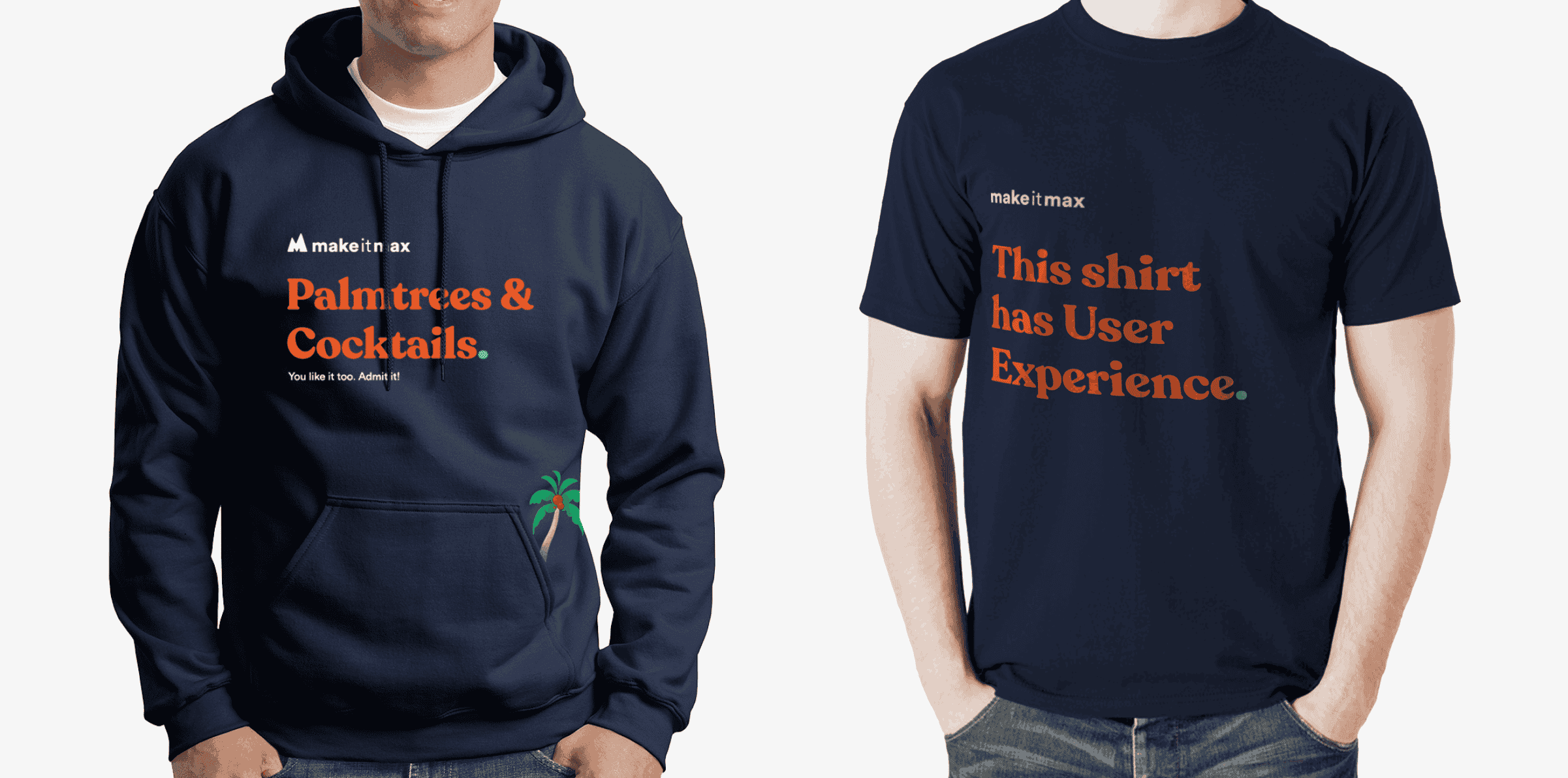
And finally, Make it Max saw the light of day
Ready to give everyone the full Make it Max experience and carry brands to their true maximum. Do you want a brand that people will want to work with or buy from? Get in touch! We’d love invite you over to our tiki bar for a brainstorm session. Yes, with palm tree and cocktails. We don’t do half experiences.
Let’s have a chat!
About designs, development, your situation, palm trees, birds and bees- you name it, we’ll pour the coffee
Other interesting cases
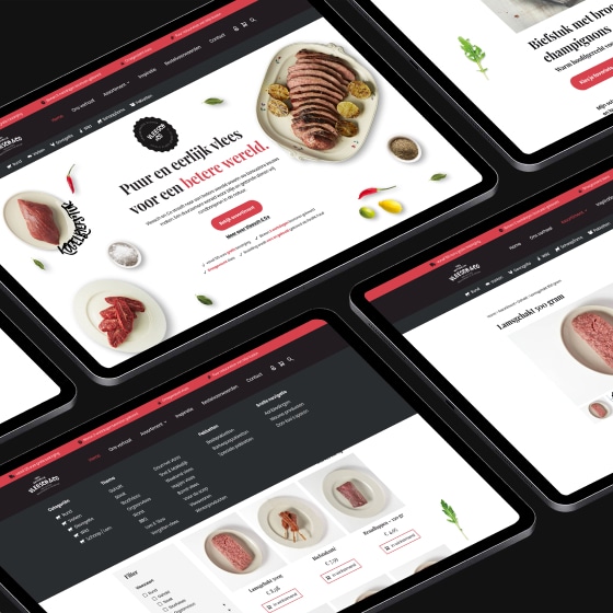
Vleesch & Co
Vleesch & Co. On a mission to a better world with a future-proof webshop.Client Vleesch & CoType WebdesignDeliverables Website, WebshopWebsite Vleeschenco.nl...
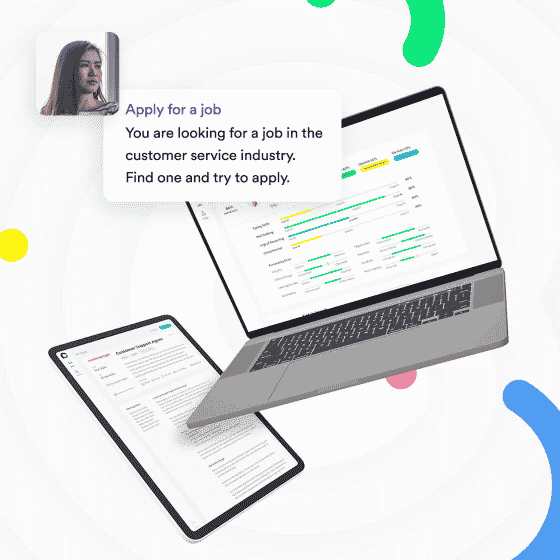
Cocoroco
Cocoroco. Testing the waters before taking the plunge.Client CocorocoType User Testing, PrototypingDeliverables User Tests, PrototypesWebsite Cocoroco.com Cocoroco is...

