
What is web accessibility?
Web accessibility, or digital accessibility, is when a digital product or service is properly designed so it’s usable for everyone, especially for people with disabilities. Think of it as an entrance to a large building. Next to the staircase, you’ll often see a slope, the slope makes the building accessible for people who use a wheelchair.
This is the kind of accessibility web design needs. You don’t always realize it, but navigating a website with a mouse and keyboard isn’t so obvious to everyone. That is exactly why you want to increase web accessibility in as many ways as possible.
When do you need web accessibility?
Of course, you should always include accessibility design when creating a new website. Unfortunately, this is often not yet the case. For some websites, the priority for web accessibility is a lot higher, for example for (semi-) government agencies, hospitals and municipalities. But schools, transport companies and housing associations should also have a high level of accessibility.
Though it may seem less important for a clothing webshop for example. But be aware of the very large group of people you exclude from using your product or service when not considering website accessibility for disabled users.
The extent to which you increase web accessibility can be very different. For example, (semi) government agencies are now obliged to fully comply with the WCAG 2.2 guidelines (Web Content Accessibility Guidelines). You can find a WCAG checklist on their website to see with which guidelines a particular website must comply.
In the next chapter, we explain which elements contribute to increasing your web accessibility, including HTML example codes to use in your accessibility design!
Elements in web accessibility design
The visual part seems very important when designing your website, but it’s really just the tip of the iceberg when it comes to accessibility design. Below, we describe which visual and code adjustments you use to make a website more accessible.
We´ll take you through the following elements for accessibility design:
Visual feedback – interactions
Voorleesfunctie – screenreader
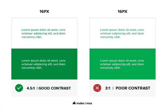
Contrast
For people with a visual impairment, the contrast on the screen is very important. They have to be able to see what they’re hovering over or about to click on, and the text should be clear and easy to read. With the WebAIM Contrast Checker you can easily check whether the color contrast on your website is sufficient for people with, for example, color blindness. The tool also checks other elements such as font size.
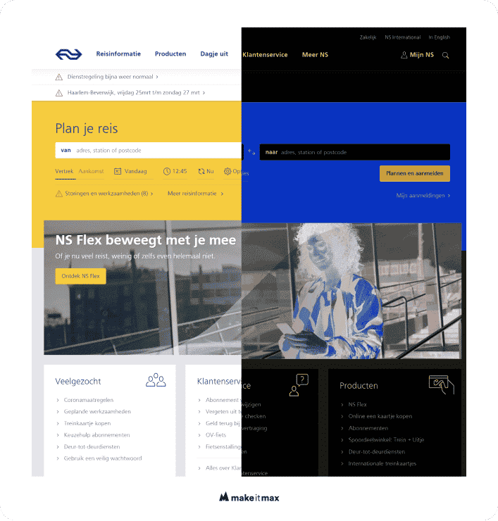
Diapositive or dark mode
Dark mode on your website is less tiring for the eyes. In 2022, people are increasingly using these modes. If they have indicated a preference for dark mode in their browser, they also expect websites to provide these options.
You can easily set this up by implementing a function on your website where it switches between light and dark mode. In this case, you have the complete design in your own hands. If users use an external tool it will make the colors on your website diapositive. Blue becomes orange and red becomes light blue.
By means of a CSS media query, you can adjust the style of a website in a fairly simple way with the light or dark mode preference of the user.
Here is a CSS only code example:
body{

color: #282828;

background: #FFF;

}
a {

color: #0033cc;

}
@media (prefers-color-scheme: dark) {

body {

color: #FFF

background: #282828;

}
body a {

color: #FFF;

}

}
Layout
Many people with a high level of visual impairment use a screen reader. This software reads a website to a user. You can imagine that the order in which you present the content on your website is very important for screen readers. You want to take this into consideration while designing the layout of your website if you want to strive for digital accessibility.
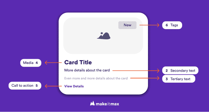
Cards
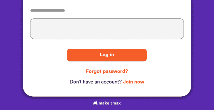
Cards are elements on websites that bundle content parts that belong together. Think of a news item consisting of a title, picture, date and call-to-action (or URL) to the actual article. You want to design the card in such a way that the call-to-action forms a clear element, so it’s easily detected by screen readers. If the entire card is clickable, the screen reader will run into problems and as a result, it will read the actual URL behind it. And that definitely doesn’t make things more clear for the user.
Menu
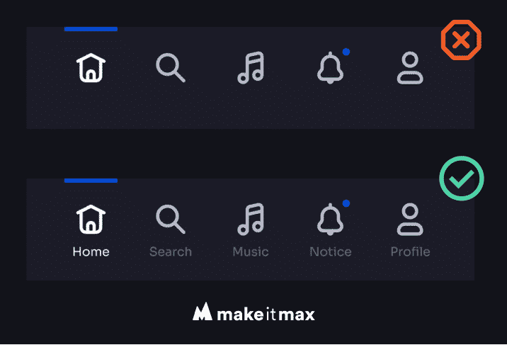
Sure, it looks nice to use only icons in your menu, but it definitely doesn’t add to the web accessibility. So if you’re using icons (like a hamburger, shoe, calendar or whatever), always add text to them. This makes your website more accessible and user-friendly to all users, not just for those with disabilities.
You also want your users to clearly see where in the many they are in relation to other menu items. It’s very useful for screen readers that the menu is read out first. So preferably, place the menu at the top of the screen.
Buttons
A button should look like a button, like a call-to-action should look like a call-to-action. Sounds simple, right? You’ll be surprised as to how often websites get this wrong. Basically, a button allows you to perform a certain action on a website. Think of a login button, send button or (sometimes anything but user-friendly) pop-ups. These actions differ from buttons like ‘Visit our blog’ or ‘View item’ which take you to another place on the website.
The difference can sometimes be hard to determine. The most important thing is to be consistent with your buttons and call-to-actions throughout the website, in color, design and wording.
Fonts
Some fonts are more readable than others. To increase the web accessibility design, pay attention to the shape and cross-section, as well as the height, width and distance between letters. A thin (or light) font is generally less legible than a bold one.
Avoid fonts that have very contrasting shapes, such as Bodoni. The reader should have as little difficulty recognizing the letters as possible. The more character in a font, the more difficult they are usually to read.
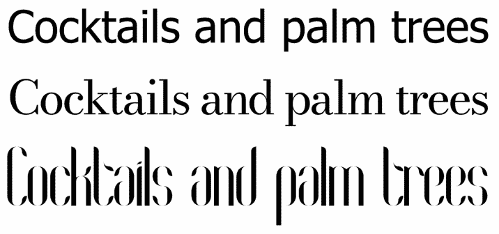
For people with dyslexia, a lot of contrast between the letters can actually be helpful. For example, an ‘o’ should not be too similar looking to an ‘a’. Some fonts use very round shapes, such as Comfortaa. Here the ‘a’ and ‘o’ are way too similar which seriously undermines the digital accessibility for people with dyslexia.

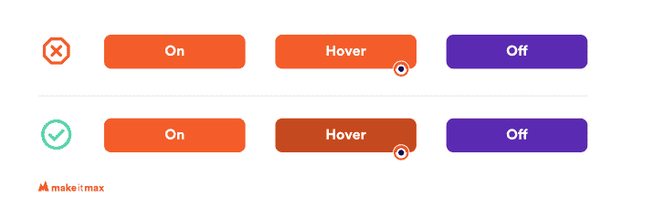
Visual feedback – interactions
In order to take all users into consideration as much as possible, you have to serve a group that is in between good sight and blindness. The degree of visual impairment can vary greatly. And that can make accessibility design extra challenging. But with the elements from this article, you are well on your way!
We already discussed contrast and fonts, but for this group, visual feedback is essential for digital accessibility. The location of your mouse or tab (Tabs will be explained in the chapter Tab function) should be clearly visible. We call the feedback with the use of tabs ‘Focus state’. With the use of the mouse, we call it ‘Hover state’. When you tab or move your mouse over an element, you want the clickable parts to announce themselves. A practical method is to illuminate an element by means of a different color (with of course sufficient contrast).
Extra tools
Reading line
Some users benefit from a kind of ruler to make a text easier to read. Like when people use a bookmark to slide over a page from top to bottom. You realize such a tool with a bit of JavaScript, HTML and CSS.
Here is an example:
HTML
<button class="active_ruler" aria-label="open ruler">Activate a ruler</button>
CSS
body{

#ruler {

position: absolute;

height: 10px;

width: 100vw;

left: 0px!important;

border-radius: 50%;

border: 2px solid black;

border-radius: 0px;

background: black;

box-sizing: border-box;

z-index: 9;

pointer-events: none;

transition: opacity 0.3 ease-in-out;

}
#ruler.inactive{

opacity: 0; /* state before activating the ruler */

}
#ruler.active{

opacity: 1; /* state after activating the ruler */

}
JS
$( document ).ready(function() {

// button onclick toggleClass .active to make the ruler visible

$(".active_ruler").click(function(){

$(".inactive").toggleClass("active");

});
// ruler div follows mouse movement

let ruler = document.getElementById('ruler');
const onMouseMove = (e) =>{

ruler.style.top = e.pageY + 'px';

}
document.addEventListener('mousemove', onMouseMove);

});
Screen reader
When increasing web accessibility in design, you want to consider screen readers as early on as possible in your coding. The way you build the HTML can make a huge difference. Fully programming for a screen reader that works for every visitor is a lot of work, luckily external libraries are available as well.
Often, however, these users already have their own software. In any case, implement the following HTML codes to increase accessibility for screen readers:
Title Tag
Use a clear <title>Insert your unique and informative title here</title> tag. This is the first thing users with screen readers hear when they land on a page.
The title should be placed in the <head> of the HTML.
Landmarks
You want to use a clear HTML5 structure, not only for neat code, but also for digital accessibility. You can find examples of this to combine with ARIA landmark. For example, when using a <nav> section, the screen reader tells the user that this is a navigation element.
With an AIRA label, you explain this even further so that the user knows what this is the main navigation. In addition, with the ARIA landmarks, it is possible to tell a screen reader a little more about a Div. Normally, a DIV can’t be ready by a screen reader, and now it can.
Example code:
<nav aria-label="main navigation">

<ul>

<li>Homepage</li>

<li>About us</li>

<li>Contact</li>

</ul>

</nav>
<footer>

<div class="address_information" aria-label="Address information">

<span>City</span>

<span>Straat</span>

</div>

</footer>
(Source)
Roles
Sometimes it happens that the URL on a website is not defined as a <button> in HTML, but is inline with a <a> tag. To make it clear to screen readers that this is a button, you can add a ‘role’ to it. This can also be done with navigation and other elements.
Example code:
<a href="#" role="button">button link</a>

<div role="navigation" aria-label="main"></div>
(Source)
Make images readable
Title and alt tags are often forgotten or not taken seriously when uploading images to a website. A screen reader, however, used the alt tags to tell a user something about an image. If you skip this, it could mean the reader is going to miss out on important context.
So always fill out the alt tags and describe the image as clearly as possible, and take a moment to consider digital accessibility for all users. Bonus: filling out the title and alt tags contributes to the Image Search Optimization for Google. Win-win!
The title tag is only displayed as a tooltip when you hoover with the mouse over the element. But you only use this when it makes sense.
Your alt tags are therefore indispensable for screen readers. Google also uses these tags to get a better understanding of the image and to present it to potential users in all the right places. Think of the alt tag as an alternative piece of text. If the image is unclear, it is extra pleasant for this user if there is a well-formed alt tag behind it.
Example code:
<img src="orange-ball.jpg" title="" alt="Orange ball on a green soccer field"/>
Navigation
More often you see these beautiful mega menu’s, super cool! However, not so accessible to users with screen readers. So this group will most likely traverse the website in one of the following ways:
Headings
Correct use of hierarchy in the headings <h1> to <h6> makes it clear to someone with a screen reader what the page is about and where the important information is.
<h1>Your title or main subject</h1>, see it as the title of a book followed by an introduction
<h2>A subheading of the h1 where you dive deeper into the subject</h2>, like the chapters in a book.
<h3>A subheading of the h2 when you want to add a detail or any extra information</h3>, for example a summary, bullet points, and so on.
You can continue these headings up to h6, as long as you don’t skip any. As a bonus, a clear hierarchy helps Google index the pages, which contributes to the authority and SEO of a website.
It is also highly useful to place a table of contents at the top of a page based on the subheadings. You can make this scrollable as followed:
Example code:
<h1>Main subject</h1>

<div class="table_of_content" aria-label="index">

<h2>Index</h2>

<ol>

<li><a href="#subject">Sub heading h2</a></li>

<ol>

<li><a href="#sub-subject">Sub heading h3</a></li>

<ol>

<li><a href="#sub-sub-subject">Sub heading h4</a></li>

</ol>

</ol>
<li><a href="#subject2">Sub heading h2</a></li>

</ol>
<h2 id="subject">Sub heading h2</h2>

<p>content</p>

<h3 id="sub-subject">Sub heading h3</h3>

<p>content</p>

<h4 id="sub-sub-subject">Sub heading h4</h4>

<p>content</p>

<h2 id="subject2">Sub heading h2</h2>
Tab function
Since not everyone uses a mouse, it’s necessary for them to be able to ‘tab’ through the website using the tab key on the keyboard. This is often without visual feedback, such as a border around a call-to-action. However, with just a small piece of CSS you can quickly increase your web accessibility for tab-users.
Example code:
:root {

--webkit-focus-ring-color: 011E41;

}
a:-webkit-any-link:focus-visible {

outline-offset: 1px;

}
:focus-visible {

outline: -webkit-focus-ring-color auto 1px;

}
Skip to content
The tab function is great, but if you have a lot of call-to-actions on your website, it will take the user forever to get to your main content. Give them a hand by implementing a skip-to-content button. Then add a tabindex=”-1” to the HTML element for an extra accessible website.
Example code:
HTML
<a class="skip-to-content" href="#main "aria-label="skip content">Skip to content</a>
<p id="main " tabindex="-1">Lorem ipsum dolor sit amet, consectetuer adipiscing elit. Aenean commodo ligula eget dolor. Aenean massa. Cum sociis natoque penatibus et magnis dis parturient montes, nascetur ridiculus mus. Donec quam felis, ultricies nec, pellentesque eu, pretium quis, sem.</p>
CSS
.skip-to-content {

background: #e91e63;

left: 50%;

padding: 8px;

border-radius: 5px;

position: absolute;

transform: translateY(-100vh);

transition: transform 0.3s;

color: #FFF;

text-decoration: unset;

font-family: arial;

box-shadow: 0px 10px 20px #e91e63;

}
.skip-to-content:focus {

transform: translateY(0%);

}
Content
Your writing technique also contributes greatly to your web accessibility. You want the copy on your website legible for all kinds of users. The following guidelines will increase the accessibility of your copy:
- Use the active voice.
So don’t say: This is what you could do to increase your web accessibility
But say: Do this to increase your web accessibility.
Never make sentences longer than needed. Can’t avoid a longer sentence? Don’t worry, just make sure the next one is shorter to balance things out. This way of writing also contributes to your website’s SEO ranking as it helps Google classifying your copy as easy to read, and thus accessible.
- Keep your paragraphs sweet and short.
Users will get lost in large chunks of copy, and they’ll probably leave your page.
- Avoid jargon.
Difficult or long words will decrease your copy’s readability and thus accessibility. Accessible copy should be clear and understandable for everyone. A lot of formal and old-fashioned words can also seriously detract from your content. Can’t come up with a good alternative? Enter the word on Thesaurus.com for inspiration. For example, instead of writing ‘nevertheless’, why not say ‘still’, ‘though’, or ‘yet’? Easy peasy!
- Make copy scannable.
This one is quite easy. Use clear headers, blank spaces in the right place, a summary, and bullet points here and there, and important parts in bold. This helps people who skip the reading to still catch a glimpse of the important information.
- Pleasant line height.
Not just the distance between the letters, the distance between the lines can really make or break the accessibility of copy. If the line spacing is too large, it gives the impression of blank spaces. If the spacing is too narrow, it will look like a large chunk of copy which is tiring on the eyes.
The takeaway
Don’t reinvent the wheel when working on your web accessibility design. Many users like using conventions. Just as a ‘save’ button is an image of an old-fashioned floppy disk (I mean, who still uses these anyway?), everyone knows what it means!
Accessibility is becoming increasingly important, so make your website digitally accessible to everyone.
Need help?
Not sure where to start? Feel free to contact us! Make it Makes takes you through the accessibility of your website. And together we will look for opportunities that will allow you to open your doors to a whole new group of people. Of course, while enjoying our signature cocktail. 😊


0 Comments