As a designer, you can help sell some stuff and make things look more aesthetically pleasing, and that’s probably what the gross of designers do. But you can also make a difference. As David writes in his book: “Designers have enormous power to influence how we see our world, and how we live our lives.” How do you make a difference through communication design?
What is communication design?
Designers think about the message that is told in the (brand) story and visualize this in one single image or brand. Because images say more than words, right?
We used to use the term graphic design a lot, but since the uprising of the digital age, more people use the term visual design or communication design.
Communication design beholds more what designers do nowadays. It’s much more than making a visual; it’s forming the strategy involved in expressing information through visual design. Communication designers work together with marketing and brand strategists to constitute one single clear message. Everything that is communicated with a design fits that particular message.
Design to make a difference
Okay, so now we’ve made clear what communication design is, how can design make a difference, you may ask? As a designer, you have to know your audience, so you know what speaks to them and what they pay attention to.
Let’s use some examples to emphasize this:
Say you’re in need of a sign for a theme park. It should say: ‘If you’ve lost your parents, find a staff member, and they will help you look for them’.
Obviously, this is a sign for young children. So from the top of our head, what are children attracted to? Bright colors and round shapes, for example. Which sign would they first set their eyes on?
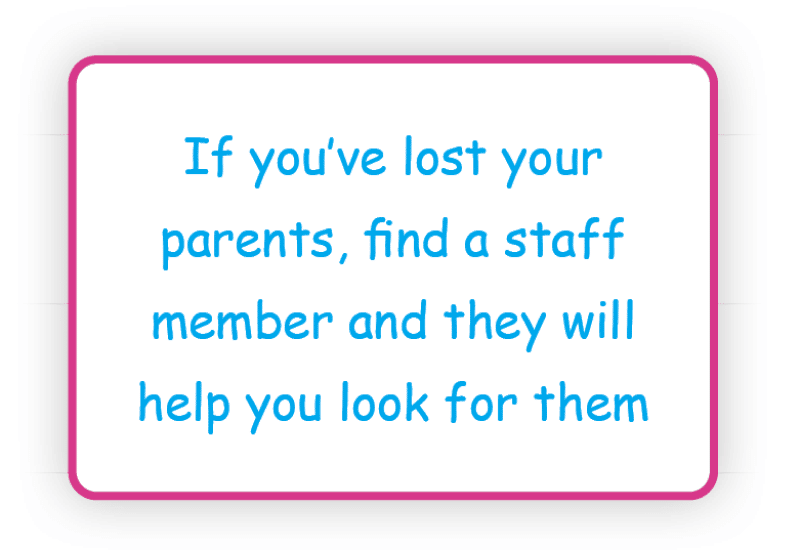
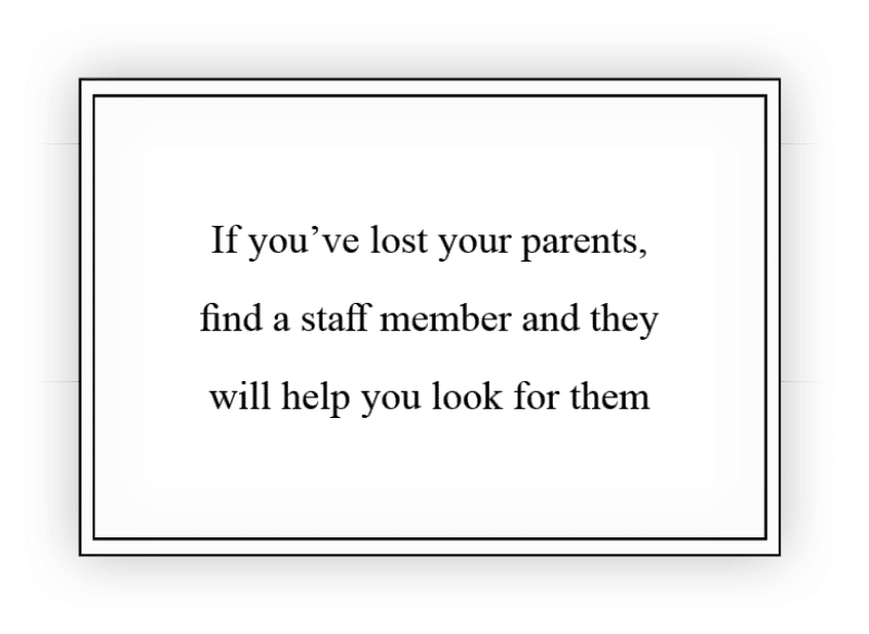
This is a very simple example of how a design can communicate different things. Although the text is exactly the same, the two designs communicate two entirely different messages. The first sign has bright colors, round corners and a friendly font (Yes, it’s Comic Sans, and we’ve devoted an entire website to it!). The second sign has a far more serious vibe to it. It’s in black and white, has sharp edges, and the font is Times New Roman (the newspaper font).
This is what a communication designer does. For such a simple sign, there are numerous decisions to be made to convey the right message.
Communication design to make life easier
Let’s take a look at some more examples:
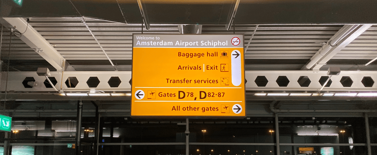
One of the most recognizable and best examples of communication design and how design can make a difference (in our opinion) is the way finding at Schiphol. It’s simply a piece of art, communication design at its best!
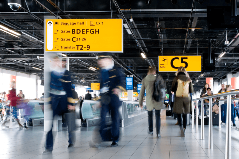
The way finding specialist Mijksenaar started in 1990 working on the way finding of Schiphol and improved it until 2002. Paul Mijksenaar tells in this short video about how he started from the traveler’s point of view, we say yay to that!
There is no better way of making this a successful project than by starting with the user. Mijksenaar aimed to make the whole experience of traveling a bit less stressful by having clear communication design at the airport to start (or end) the voyage with.
They also used worldwide conventions as icons to communicate in a simple and effective manner. All way finding is positioned perpendicular, and all advertisements are placed parallel to the direction travelers are moving. This way, advertisements won’t get in the way of the way finding.
Since the way finding designs of Schiphol a lot of other way finding systems have used this clear way of communication design like different airports in the USA, hospitals, public transport systems and universities.
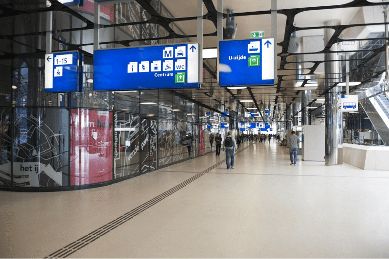
Maybe you have noticed some resemblance, but Mijksenaar also executed the way finding of the NS (Dutch Railway System).
Designers can make a difference too
As a designer, you can also make choices that help the world. For example:
Green IT
Honestly, we haven’t put much thought in this before. But every time you load a website, it is responsible for a certain amount of CO2 emission. On this website, you can check what your website emits: websitecarbon.com. Ugh! That’s a harsh wake-up call!
In Tim Frick’s book Designing for Sustainability he emphasizes that the internet is growing out of proportion energy wise. “If the Internet were a country, it would be the sixth largest in terms of electricity use”.
And Climate Home News states that “The communications industry could use 20% of all the world’s electricity by 2025.”
So as designers who sit behind the internet 90% of the day, we can have a huge impact on this! Just start small and don’t leave your computer on standby all night 😉.
Inclusive and accessible design
In our blog about accessible design, we talk about how to design for people who have disabilities. Inclusive design includes people who have a larger array of disabilities and impairments. Not only permanent but also situational and temporary impairments like, for example, people who are pregnant, have a broken arm or who are distracted. With empathy, you can design a product or service for the largest group possible.
Ethical principles
You can choose who you work for. Designers are not slaves. We can decide if we want to work for a certain company. Especially if we have questions about their ethics. Because designers can have a huge impact on how users perceive a brand or any other communications, there lies a responsibility in what we do.
The takeaway
As a communication designer, you get to decide what project you want to work on (most of the time, and it’s a luxury, we know). You have the ability to make a huge impact on how people perceive the things you design. You’re not just a slave of your clients. Sure, you also need to earn a living, but how you earn it that is up to you! If you design with this in mind, you’ll definitely make a difference!



0 Comments