What is responsive UX design?
After we’ve got all the research done, we can get to making the wireframes, we don’t just smack some text and pictures on a page. First, we have to think about the size of said page. Is the project an app that will mostly be used on a mobile device, or is it a tablet based platform? These things matter a lot! Because this defines how we approach making a wireframe and designing our elements.
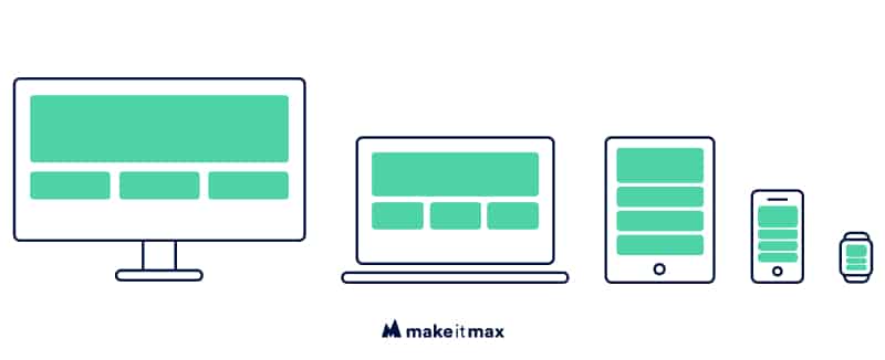
Responsive UX design is a solution to create a pleasant and consistent user experience throughout all devices and screen sizes. The experience on all devices needs to be the same, this does not mean every element has to have the same looks, but as shown above a menu needs to be accessed easily. So it functions differently on different screens, but for the purpose of that screen it is the right experience.
When and why do we use responsive UX design?
As UX designers, we think you should ALWAYS make a responsive design. That’s the ‘when’. As for the ‘why’; in the last couple of years, the number of devices we can access the internet with has grown exponentially. Think about phones, tablets, smartwatches, etc. All these screens have a different size and resolution.
What will happen if you have a website made for a desktop screen and someone on an iPhone SE (the most used small screen size) fills in a form? If this form looks and acts the same on all screens, some elements would fall off a mobile screen or look way too big on such a small screen.
Plus, the way people use a phone compared to a big screen like a desktop is very different. A phone is used with our hands; we swipe, tap and drag. A desktop user has a mouse and keyboard, so he clicks and scrolls. The distance of a desktop screen is also further away from our faces than a phone screen. You can’t use a hover on a phone, swiping on a desktop is not really intuitive.
Also, a mouse pointer is much more precise than a finger. We have a word for mobile designs that is made for use with fingers; fat-finger-friendly. It means; don’t make mobile elements too small or people with larger fingers can’t press it easily, or they press two buttons at once. We wouldn’t want that, right?
How do you start with a responsive UX design?
First, to take a glimpse into what we’re dealing with, not only do we have to know how the to-be-designed-product is mostly used on, but also which screen sizes are most common these days. Because you can’t make a responsive UX design for every possible screen size out there, we have to make an average that would fit all screens.
We pick the smallest size there is and the most used size. Nowadays, it’s usually 320 × 568 pixels for an iPhone SE and 1920 × 1080 pixels for a desktop screen. Sometimes, if the design is intricate, we also design a tablet version.
Statcounter provides a very detailed graph of which screen resolutions are commonly used. As we know, mobile devices have been taking over a lot of internet and platform usage, but desktop and laptop screens still have a great part in these percentages.
Responsive UX design is having to think about down scaling, upscaling or changing all elements, so they fit and function on every screen. Just take a look at a menu, have you ever used the same website on your desktop and on your phone? If a desktop menu would look the same on mobile, no one could use it.
How do you design responsive?
There are multiple ways to approach a responsive UX design. A lot of people swear by mobile first design; start with a small screen and make everything fit, then it’s just a matter of scaling everything up until you have a desktop design.
The other way around is by starting with a desktop design, this is mostly done for platforms that will be mostly used on desktop, and scale down to a mobile screen. Sometimes elements will disappear from mobile screens; if an element doesn’t have a function or if it is too difficult to use, it’s better to leave it out.
Breakpoints
When starting the development of responsive UX design for a website or platform, it’s very important to use breakpoints in the CSS, this is a piece of code that determines when an element has a different layout. So if a breakpoint is 640 pixels, this means when a screen is smaller than 640 pixels, a different layout than the desktop layout is used. Be sure to always use responsive CSS.
Columns
Using breakpoints in responsive UX design becomes easy when you use columns. Normally, a responsive website uses a 12 column grid. We use this because you can divide 12 by 2, 3, 4 and 6. This way you have maximum flexibility when designing your layout.
Responsive design vs adaptive design
Another way to make sure your website or app looks and responds well on all screen sizes, is to make an adaptive design. The difference between a responsive design and an adaptive design is that with an adaptive design you have different fixed layouts and a responsive design has a fluid transition between screen sizes.
An adaptive design also makes use of breakpoints, but the browser will tell the website when and which layout to use. These days, adaptive design isn’t as popular as responsive design because of the quickly changing and growing number of different screen sizes.
The takeaway
Nowadays, it’s more important than even to have a responsive designed website. Because of the up march of (new brands and) all the different devices that are released, only one or an adaptive design isn’t sufficient anymore.
By designing a responsive user experience, you also make sure your brand is perceived the same on all platforms and screen sizes. Nothing is more annoying than using a website on a screen where it just doesn’t seem to fit, and you struggle using different elements. You don’t like it, and certainly your users won’t either.
So if you are having trouble giving your website a facelift by finally getting that responsive design right; just give us a call, and we’ll set you up under a palm tree with a cocktail, while we work on your website. See you soon!


0 Comments