Cocoroco.
Testing the waters before taking the plunge.
Client
Cocoroco
Type
User Testing, Prototyping
Deliverables
User Tests, Prototypes
Website
Cocoroco.com
-
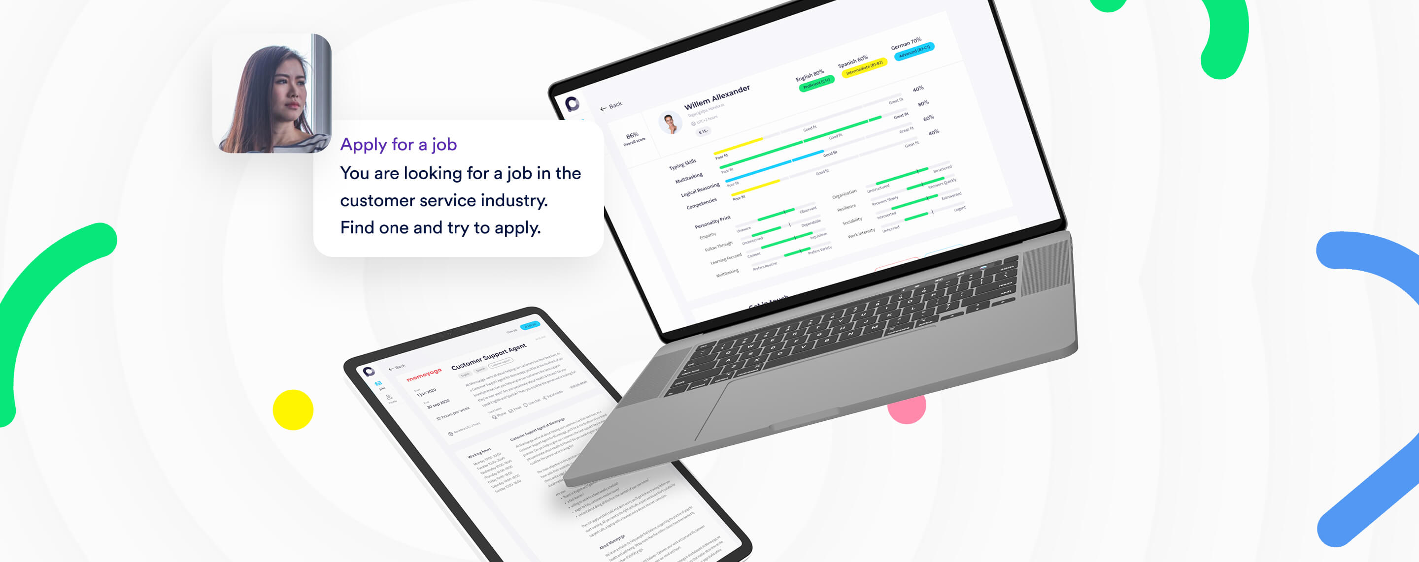
Cocoroco is building an online platform that connects companies looking for CX talent to remote workers all around the globe. But before building the MVP version of the platform, Cocoroco wanted to test how the designs performed with their future users.
We decided to apply our user testing method, to identify pain points before Cocoroco reaches development and to find out whether or not their new digital platform is a winner. We were able to make recommendations that would ultimately lead to a better, highly efficient and more intuitive interface. Want to find out how? Let us take you through this awesome case!
Choosing the testing method
When it comes to user testing a brand new platform, we usually advise a qualitative testing method as it provides us with in-depth and contextual insights. We carefully selected a handful of people who have affinity or past experience with recruitment and CX for a moderated 1-on-1 user test.
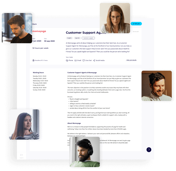
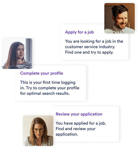
These participants would later be dropped into a prototype of the new platform while being closely observed by one of our researchers. But first our researcher had to write out the scenarios. We created two scenarios, scenario one being a hiring manager posting a job and looking for the perfect match and scenario two being a worker looking for a job in CX.
Forging the prototype
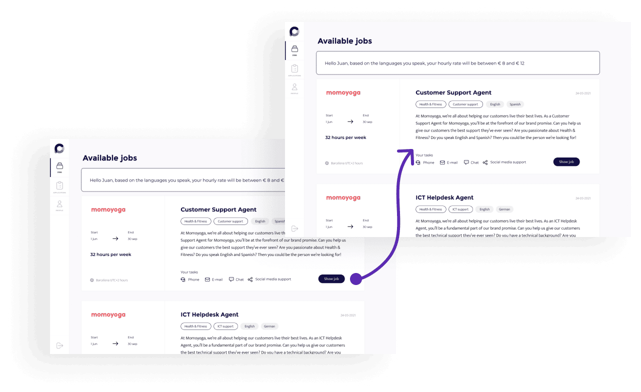
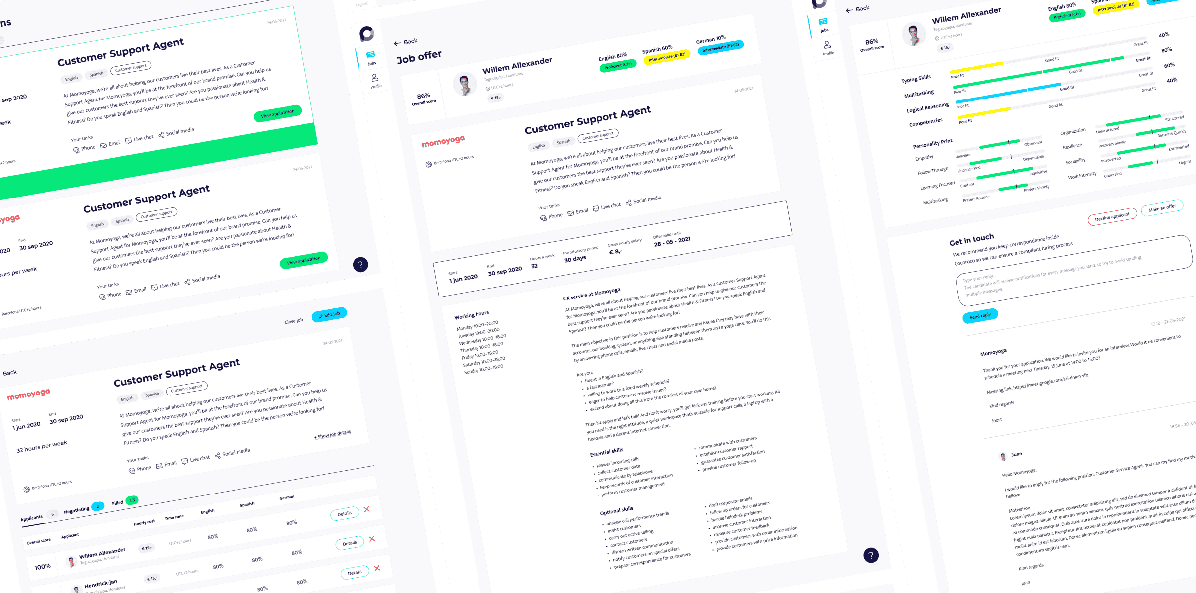
Based on the sitemap and the first sketches of the wireframes, we used our software to build a functional prototype. By giving the simulation basic functions we were able to properly test the user interface and make the prototype look and feel as close to a real deal as possible. The prototype consisted of a mapped out flow based on the two scenarios we were going to test with real users.
User testing preparation
With the functional prototype, scenarios and participants in place, it was time to prepare for testing-day (T-Day). We wrote a script for the participants which consisted of a short interview, an introduction, tasks to complete within the interface, a feedback round and the debriefing.
As our participants were from all over the world – just like real Cocoroco users – we set up digital meetings with our researcher. This allows our researcher to observe the participant’s actions, facial expressions and thoughts (we ask them to think out loud, we’re not secretly X-Men) through screen sharing, video and sound. How 2021 of us!
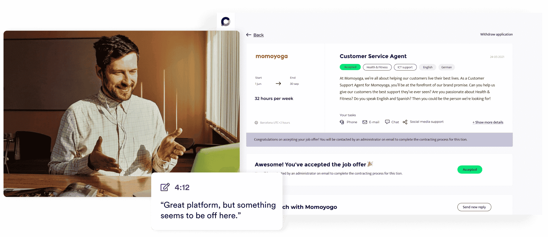
The big day – 2021 style
It’s t-day! And as the research-nerds that we are, this is what we live for. The participants were asked to take their time, think out loud and not to withhold any thoughts or feelings – whether positive or negative. Based on the scenarios the participants were given tasks to complete. After each task (e.g., register to the platform, post a job, compare candidate profiles, etc.), we asked a few questions to gain deeper insights.
Throughout the observation, we took notes and documented the thought process as well as each and every action, from a spontaneous smile to a hovering mouse. After completing the scenarios, the participants were asked one last time about their opinions, thought process, what they liked or disliked and if they had any recommendations for Cocoroco.
Our findings
T-day was in the books and now it was up to us to actually research the findings. The user interviews were transcribed and summarized and new insights were discovered. We categorized these new insights by frequency and importance and handed them over to Cocoroco as well as being presented during a meeting. We were able to make recommendations that would lead to a better, highly efficient and more intuitive interface.
An example of the recommendations
(we know you were waiting for these)
We discovered that all hiring managers wanted to see more personal information from the candidates than what the initial designs showed. So we recommended adding an option to upload a CV and past experiences. We also recommended several improvements for the registration form, like adding free-text fields to make it more customizable.
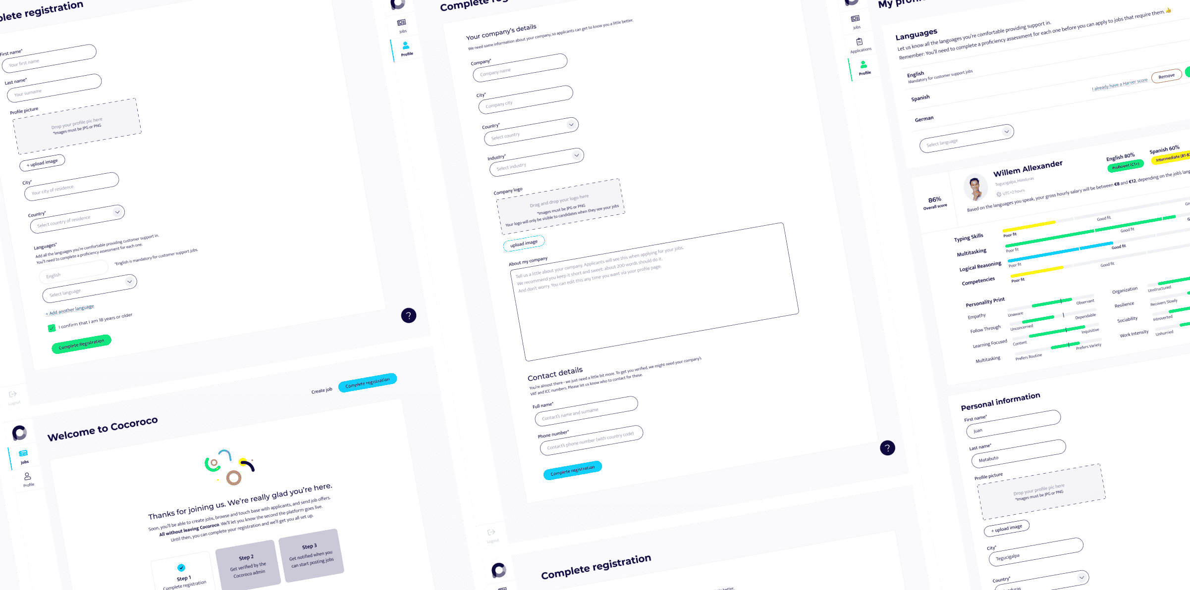
We also discovered a few unclear functions and wording limiting the intuitive flow and creating user frustrations. In essence, the new insights were considered of great value for Cocoroco, allowing them to improve the designs and later on, launch a top-notch brand new platform. Ready to take over in the digital era!
Hey, psst.. Are you building a user interface soon? Or improving an existing one?
Don’t forget to test with actual users for so many useful and reliable insights. And identity pain points before your developers make the designs final. Want to make use of our researching and testing skills? Drop us a line!
Let’s have a chat!
About designs, development, your situation, palm trees, birds and bees- you name it, we’ll pour the coffee
Other interesting cases
Vleesch & Co
Vleesch & Co. On a mission to a better world with a future-proof webshop.Client Vleesch & CoType WebdesignDeliverables Website, WebshopWebsite Vleeschenco.nl...
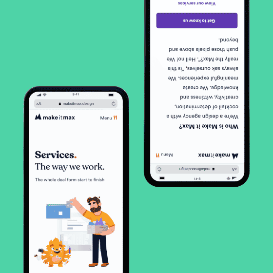
Make it Max branding
Make it Max branding. In the beginning.Client Make it MaxType Branding, WebdesignDeliverables Brand, Brandbook, Website, User Experience Redesign, User ResearchWebsite...

