Vleesch & Co.
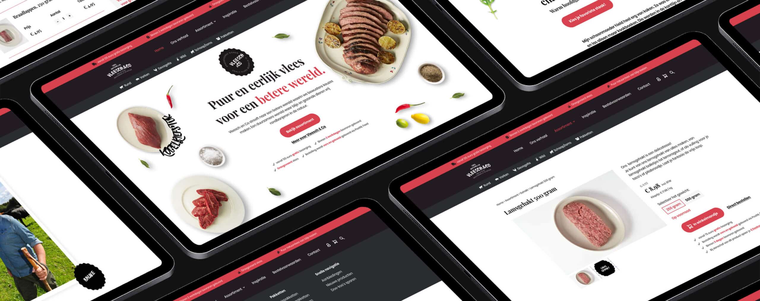
On a mission to a better world with a future-proof webshop.
Client
Vleesch & Co
Type
Webdesign
Deliverables
Website, Webshop
Website
Vleeschenco.nl
-
Vleesch & Co is on a mission to improve the world by making people aware of the origins of their meat products and inspiring them to make better choices. They do so by making meat available from animals who’ve lived a free and happy life in Dutch national parks.
Here they contribute to biodiversity instead of being bred for meat or dairy. A very important mission that lacked one vital component: an intuitive, user-friendly and easy-to-navigate webshop. A project that we took very seriously as there was a lot at steak. Pun intended.
Our colleagues over at OMCBase created a strategic foundation by applying their Growth plan which showed us the direction for the future. Then, they wrote a compelling brand story that perfectly expresses the why’s, the how’s and the what’s behind Vleesch & Co, in that specific order. It was up to us to transform their old webshop into one that is aesthetically pleasing and profitable with an engaging interface that contributes to an excellent user experience.
User journey mapping
We started by researching the old situation. How was the user interacting with the interface and were their goals easily reached? Of course, for research purposes, this meant we had to put ourselves in the user’s shoe by placing an order. This most definitely had nothing to do with our love for an honestly good piece of meat (it was delicious, by the way).
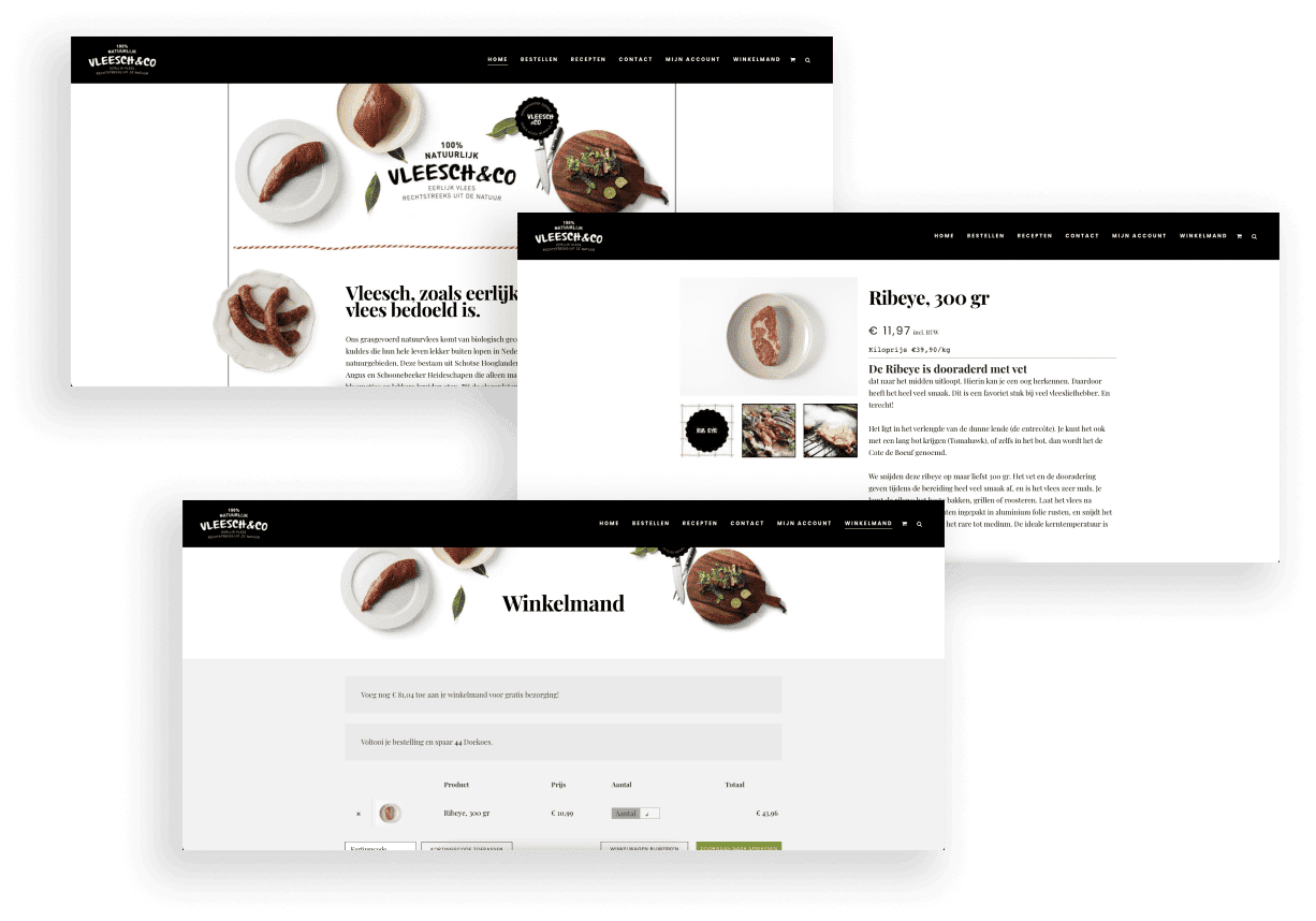
To visualize the user journey, we mapped out all the touchpoints users go through. We also included our feedback and recommendations for the new webshop. A couple of things we noticed were the outdated visuals, unclear buttons and a confusing structure. Especially the last two can lead to a whole lot of user errors and frustrations and we don’t want that while on a mission to a better world! So, before we started coding, we first had to create a new interaction design. For the sake of the world.
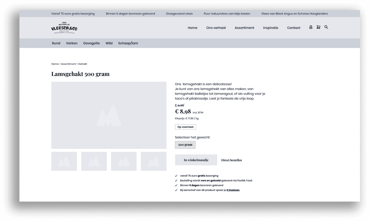
A critical step towards a pleasant and effortless user experience
We created several sketches of the recommended wireframes, better known as the interaction design. The new designs would be easy to navigate, give the right information at the right time and overall ensure that users are more likely to make a purchase from
Vleesch & Co. The mission was back on track!
Upgrading the visuals
We wanted to give the visual designs a major upgrade while keeping the corporate identity. Therefore, we reused the colors and style as much as possible, yet made it look and feel completely new and of this time. With the new visual designs, not only does the mission immediately become clear, the user will intuitively know where to go next. Each and every color and button is strategically placed so that they lead the user’s eye to where we want them.
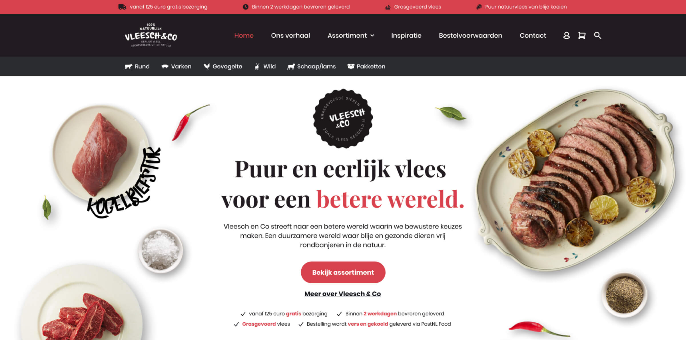
Bringing the designs to life
With the interaction and visuals designs in place, it was time to start the construction works. We worked up a concept in code and chose the right techniques based on the requirements. After successful testing from our quality assurance specialist, our designs finally saw the light of day! The new and improved webshop is inviting, pleasant to the eye and takes you on an inspiring (and mouthwatering) journey.
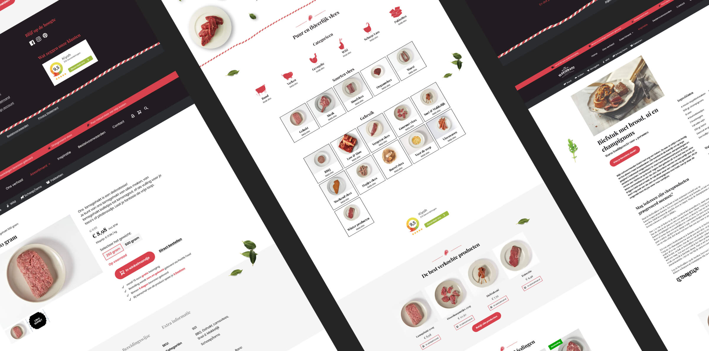
A future-proof webshop for a future-proof world!
With their improved, high-performing and user-friendly webshop in place, Vleesch & Co can continue to carry out their world-changing mission. Now even more effectively and efficiently than ever! Do you have an important message like Vleesch & Co that needs to get out there, or do you just want to take your business to the next level? We are ready to take on our next mission! Give us a call.
Let’s have a chat!
About designs, development, your situation, palm trees, birds and bees- you name it, we’ll pour the coffee
Other interesting cases
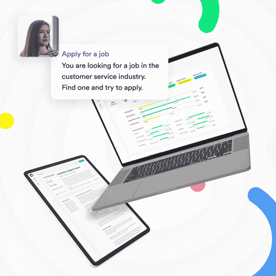
Cocoroco
Cocoroco. Testing the waters before taking the plunge.Client CocorocoType User Testing, PrototypingDeliverables User Tests, PrototypesWebsite Cocoroco.com Cocoroco is...
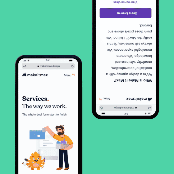
Make it Max branding
Make it Max branding. In the beginning.Client Make it MaxType Branding, WebdesignDeliverables Brand, Brandbook, Website, User Experience Redesign, User ResearchWebsite...

